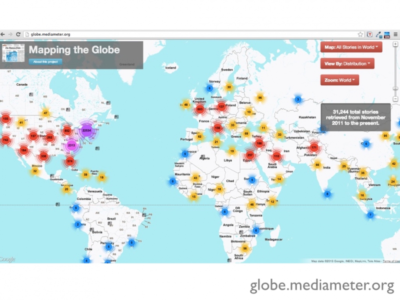
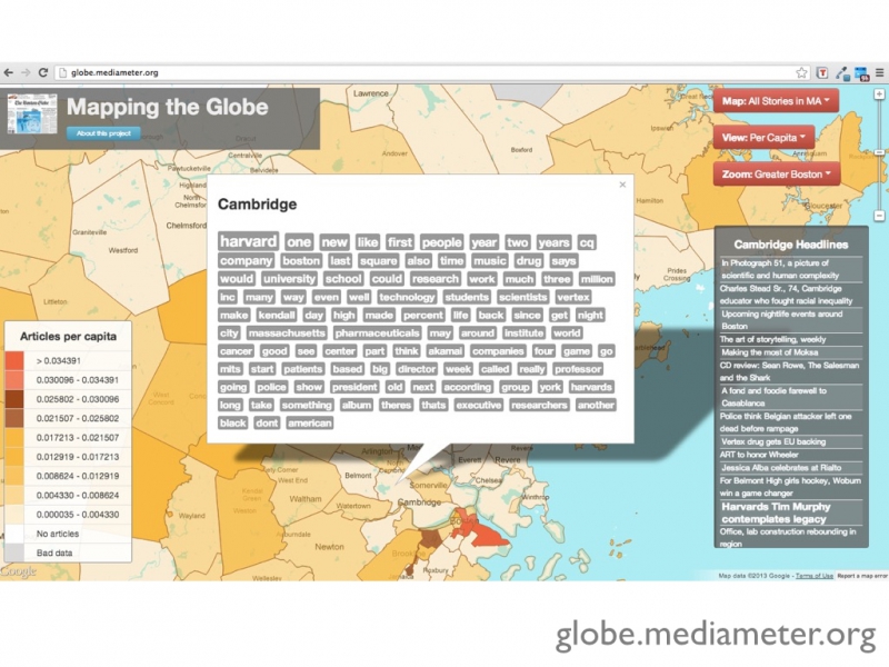
Mapping the Globe is a visualization of two years of Boston Globe news data. Using the Boston Globe’s API, I mapped the news articles to the locations that they were about. Then I used the Boston neighborhood boundaries to see which words surfaced most often in relation to which neighborhoods.
Mapping the Globe shows how the Globe “sees” different neighborhoods and towns, and what makes for news in Foxboro versus, say, Mattapan.While this was an exploratory project, there could be real-world newsroom applications for geographic analytics. One of the things the project helped show is that different geographic regions get unequal attention, both in quantity and in quality. News editors could use geographic analytics to mitigate unintended bias such as certain neighborhoods only being covered in relation to crime or violence.
More information:
- Blog post on how media attention changes across different Boston neighborhoods
- Mapping the Globe
The project was done with contributions from Ali Hashmi, Nathan Matias, and Chris Marstall (Boston Globe) and under the guidance of my awesome advisor Ethan Zuckerman.


